Vega
Wireless all-in-one 3D Scanner
Role
Product Designer
Platform
Scanner Onboard Software + PC Matching Software
Time
2024 - Present
With the booming demand for consumer-grade 3D scanning, users are seeking a lightweight, portable high-precision scanning device that breaks the shackles of cumbersome cables and heavy computer dependency —— a standalone tool that can handle scanning and basic post-processing anytime, anywhere.
Objective
Build a standalone portable all-in-one 3D scanner supporting both small and large object scanning, with on-device post-processing capability
Create an ultra-intuitive human-computer interaction system that enables 3D scanning newbies to get started with zero learning costs
What I've done
I was responsible for the end-to-end design and delivery of both the scanner's onboard software and matching PC software (only the onboard software is displayed here). My core work covers the entire product lifecycle:
🔍 Demand Analysis & Research
Stakeholder interviews and user pain point mining
Competitive product analysis and industry trend research
Information architecture design and product logic sorting
📝 Product Definition & Design
Compile detailed Product Requirements Document (PRD)
UX design (wireframe → prototype)
Visual UI design and design system building
🔧 Cross-team Delivery & Iteration
Regular sync meetings with R&D and hardware teams for alignment
Promote the implementation of product requirements, and solve technical and hardware matching problems in the delivery process
Conduct endless product testing (functional/experience/compatibility) and optimize iteratively
🚀 Launch & Post-operation
Follow up the official product launch and collect user feedback in real time
Promote continuous iteration of software functions and experience optimization
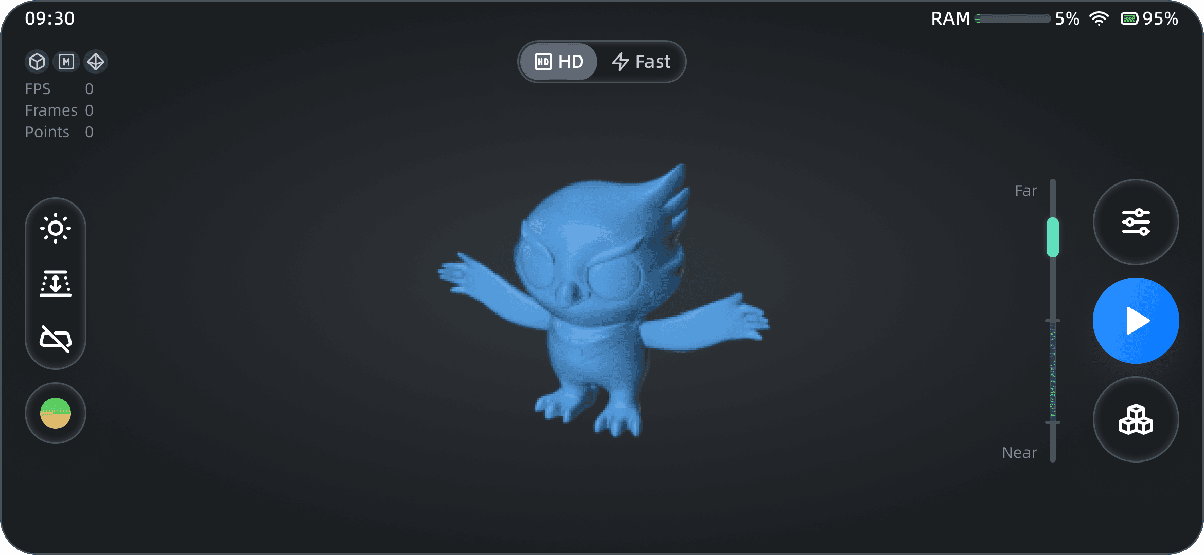
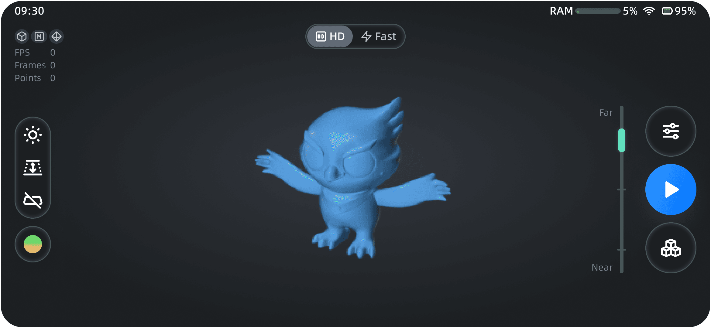
Key Design Showcase

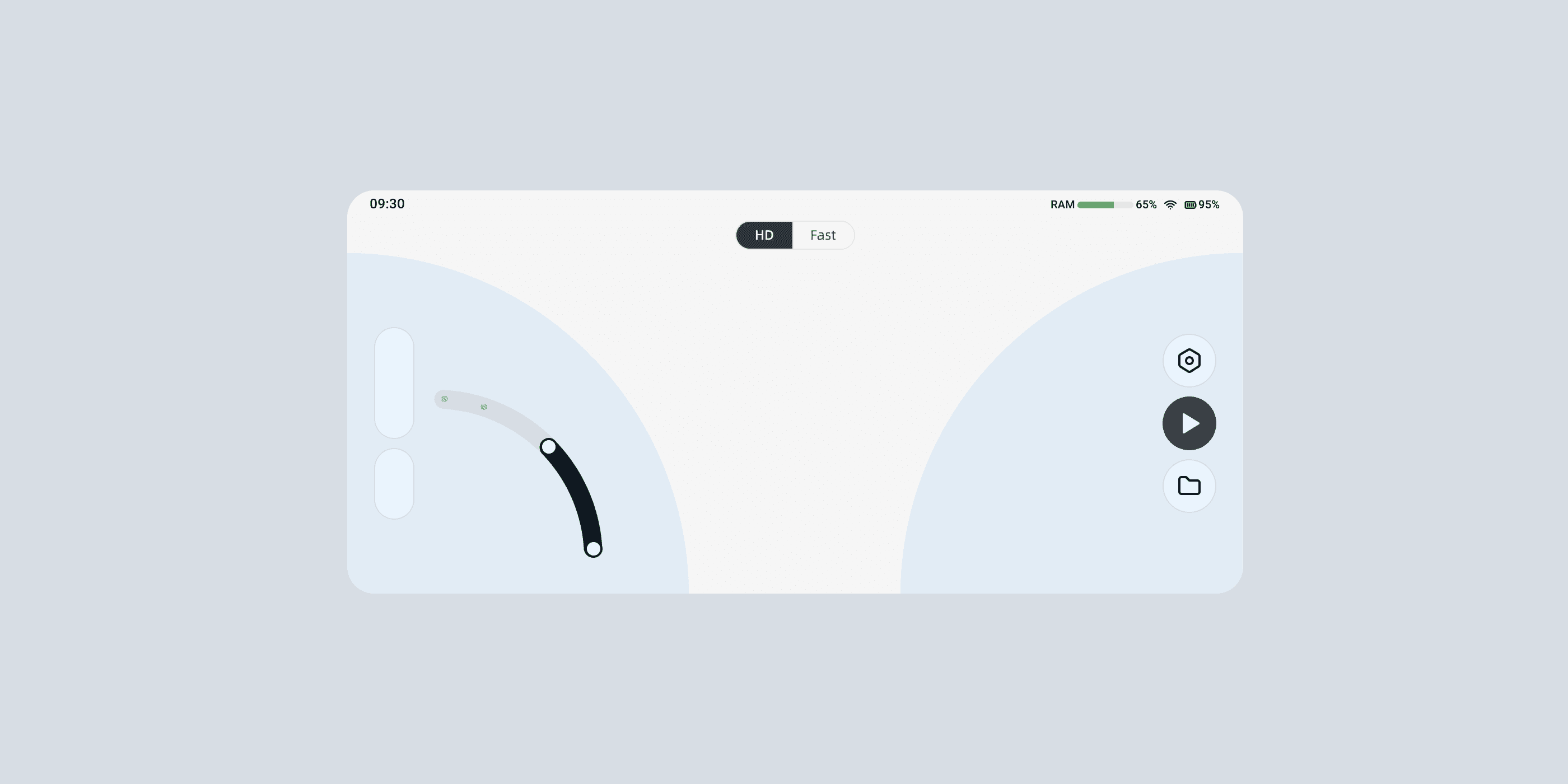
Reasonable layout suitable for using with both hands
The industrial designer gave it a silicone case with two protrusions that can be used to hold. So the right way to hold this scanner is to grip on those protrusions with both hands.
Therefore, I decided to put those key features on both sides for each thumb to be easily reached.

🎉 Bonus: Even the slider is a circular sector, slide it with your thumb is a very smooth experience.
The Navigation
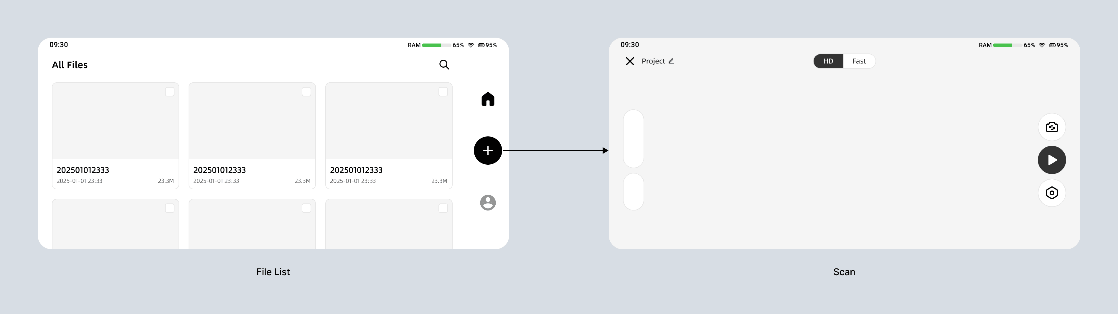
Initial Plan - You'll see the file list first, then you can click '+' to start scanning

Selected Plan - You'll see the scan page first, then you can reach file list there
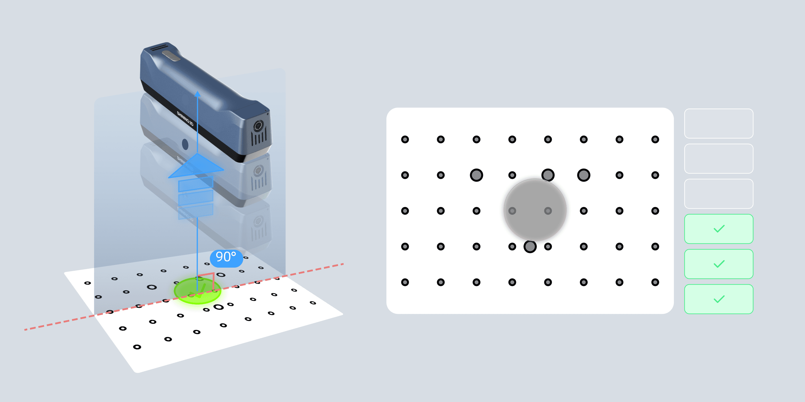
A more intuitive way for calibration
The traditional way of calibration is to point the scanner to the center of the calibration board, adjust the angle of the scanner(which has its rules), and move the scanner along the line formed by scanner and board center. At the same time, you have to keep an eye on the PC’s screen, which displays the board and the position your scanner casts on the board. As you move along the line, the scanner will automatically capture images when it hits appropriate height(which, of course, also has its rules).
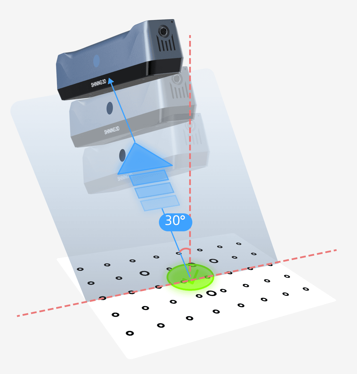
The hardest part is moving along the line, why? Because you have to keep the angle whilst keep the scanner cast at the center of the board, and also you have to twist your neck in order to look at the computer screen.
Now we have a chance to improve the experience vastly. Here're the 2 key things we did:

Offer users a stand for calibration board
With this angle-calculated stand, there's no need to keep scanner at those hard-to-keep angles. Users just need to hold their scanners horizontally (parallel to the plane where board and stand are placed) and point at the center of the board.

Turn the vertical height indicator into flat circles to represent different height
Just like a AR game. The white circle represents the current height, and blue circle represents the target heights you need to reach. The task for you is to use white circle to eliminate all blue area, then you win the game.
"The scanner is easily calibrated in just a few minutes using the calibration board and stand" —- From one comment
Light&Dark theme to adapt to different environment
You'll never know where your user would take the scanner to, so it's crucial to display the interface clearly in different lighting environment.
For developers to better implement this, I also build a design library. The design library unifies the color, typography, and component specifications of the two themes, enabling R&D to ensure 100% consistency between Figma design and the final developed UI. With carefully arranged tokens, both the figma design and the final UI developed can switch theme easily.
🎉 Try clicking the lightbulb on the bottom-right corner
Smooth transition to kill the boring waiting
There're always some actions will take more time to process, so I added a fluid animation and also showed tips for how to better use the scanner while users waiting. (Animation credits to my outstanding visual designer)


🎉 Try clicking 'Apply' on the bottom-right corner
Additionally, the colorful flowing light of the animation is consistent with the scan startup animation, forming a unified brand visual language throughout the software, and strengthening users' product memory.
🎉 Try clicking the blue 'Start' on the right
Spread out

